


Gyrochrome
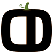
Display. The logo, and headlines that stand in for it.
Licensed to Olux. Shown here as a specimen and not included in the kit — set headlines in Poppins instead.
Olux
- Olux
- Olux
- Olux
- Olux
- Olux
- Olux
The marks, colours, typefaces and patterns Olux is drawn with. Take what you need — everything on this page is here to be used.
Two descriptions of Olux, ready to paste. Both are kept current — quote them as they are.
Olux is Luxembourg's marketplace for buying and selling new and second-hand goods, close to home.
Olux is a Luxembourg marketplace where people buy and sell new and second-hand goods — furniture, electronics, appliances and more — near where they live. It brings private sellers, professional shops and local communities together on one platform, in every language the country speaks, on the simple idea that a good find should be a short trip away.
The wordmark is the default. Reach for the symbol only where the wordmark would be illegible — an avatar, a favicon, a stamp on a photograph.
The primary mark. Use it wherever there is room.


Secondary

Alternative

Black

White
The mark comes in five colourways so that it never has to be altered to suit a background. Pick the colourway; leave the artwork alone.
Leave clear space on every side equal to the height of the O. Nothing — text, images, edges — comes closer.
Five values. Purple leads, navy anchors, and the lilac tint does the quiet work. Click a swatch to copy its hex.
Gyrochrome draws the logo and the headlines. Poppins carries everything a reader actually reads. Great Vibes appears once, by invitation.
Display. The logo, and headlines that stand in for it.
Licensed to Olux. Shown here as a specimen and not included in the kit — set headlines in Poppins instead.
Olux
Three drawings built from the letterforms of the mark, each in three colourways. Use them large, cropped and quiet — behind content, never on top of it.
Writing about Olux, or after something that isn't here — a screenshot, a figure, a quote? Get in touch and we'll come back to you.